Minder
Minder is an app that lets users meditate anywhere and anytime with its audio courses and get relief from daily stress and anxiety.
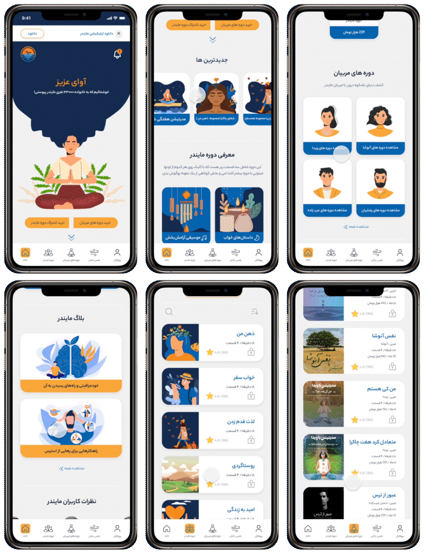
Problem:
Uncategorized and inaccessible content, which always resulted in errors, incorrect purchases, and support team intervention.
There is no user dashboard. As a result, users were reluctant to stay in the app and browse its content because they couldn't easily view or save episodes. The user interface lacked consistency and coordination, causing users to become distracted and anxious.
Solution:
Improving information architecture and redesigning the navigation menu, resulting in a success rate in the usability test was 86%.
Create a profile dashboard that matches the content of the app, including a purchase section, downloads section, settings section, and activity section.
Designing a clear visual hierarchy and an integrated user interface which facilitate access to information.


Subscription to a Plan Task
Previously, there was no clear distinction between subscription and mentoring, and finding mentors was difficult. The new design provides a variety of ways for users to access mentors and plans. By separating these features, they are more intuitive for users.
Find and Listen to an Episode Task
As part of this design, users can access mentors or plans they have subscribed to in different ways. The "View My Plans" button will appear on the homepage in the hero area once users have purchased a plan. Moreover, they can find a plan by viewing their profile, browsing their "My Plans" list, and then playing an episode. As well as viewing the last unfinished track on the home page, making it more accessible.

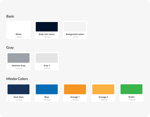
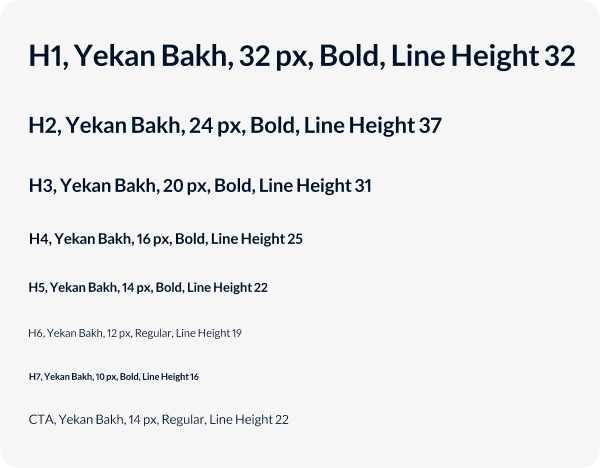
UI & Visual Design


Wireframes



Let's bring your product to the next level.
Get in touch with us to see how effective design can help you reach your business goals.

