Starbucks Rewards
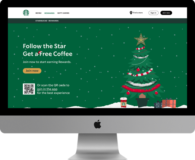
Starbucks Rewards web-page has been redesigned as a concept project that focuses on the Christmas occasion. Customers can earn and accumulate points based on purchases of products at Starbucks stores and are appreciated with free goodies, interesting tiers and engaging user experience.
Project Goal
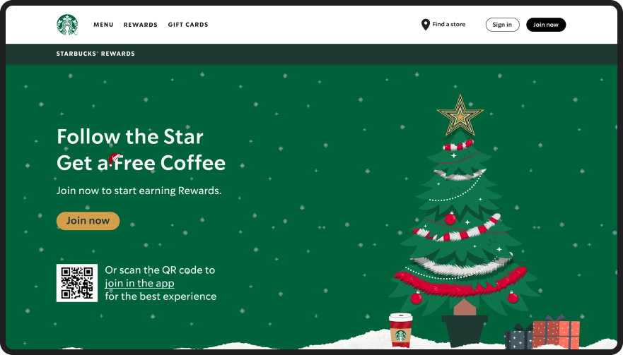
The goal of this project is to improve the user interface of the Rewards web-page by making it visually interactive and attractive. This will be achieved by updating the landing page to a Christmas themed design that aligns with the holiday season, and by integrating a dynamic feature where the user can follow a moving Christmas tree star across the page. The objective is to increase user engagement, encourage the earning of Starbucks points, and meet the expectations of clients by creating a fresh, cool, and beautiful design that follows current UI trends.


Our Process
- Heuristic evaluation
- Competitive analysis
- Ideation
- High-fidelity concepts
We began the project by performing heuristic evaluation to understand the pain points in UI design of Starbucks Rewards’ Webpage.
At the same time, we also analyzed the main competitors to identify their strengths and weaknesses relative to our product.
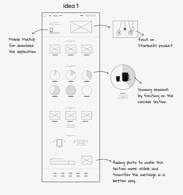
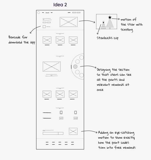
On our findings, we sketched our design ideas and after several iterations, we designed high-fidelity wireframes with the intuitive idea of the followed star as the Starbucks Rewards Program.
Sketches
Let's bring your product to the next level.
Get in touch with us to see how effective design can help you reach your business goals.


