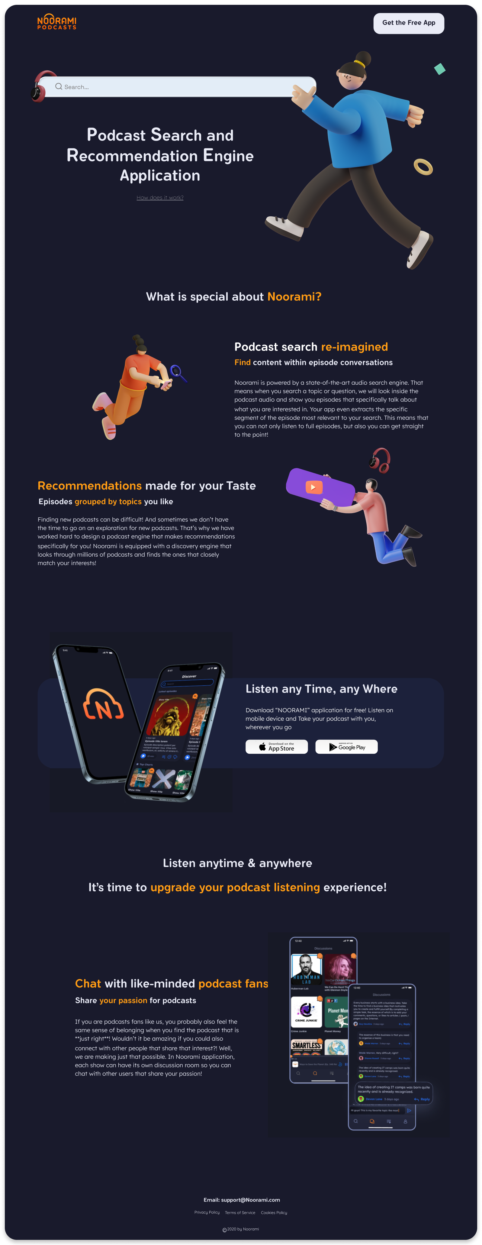
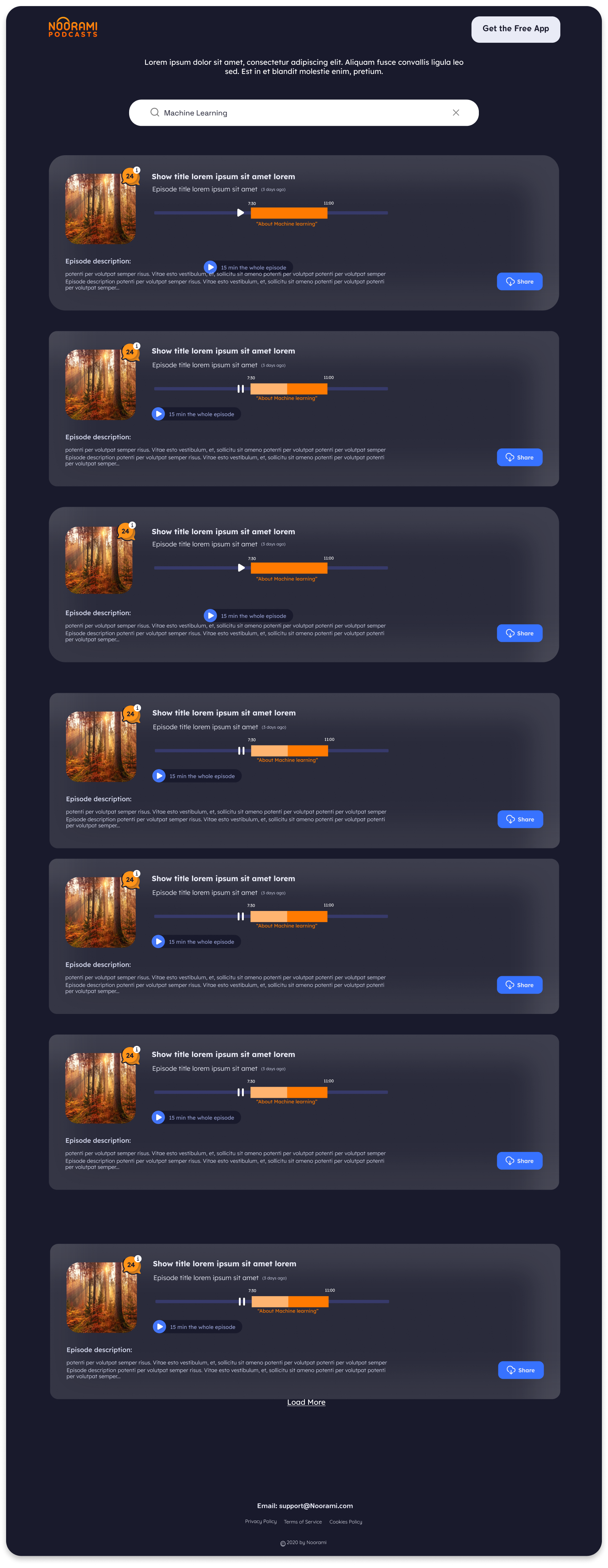
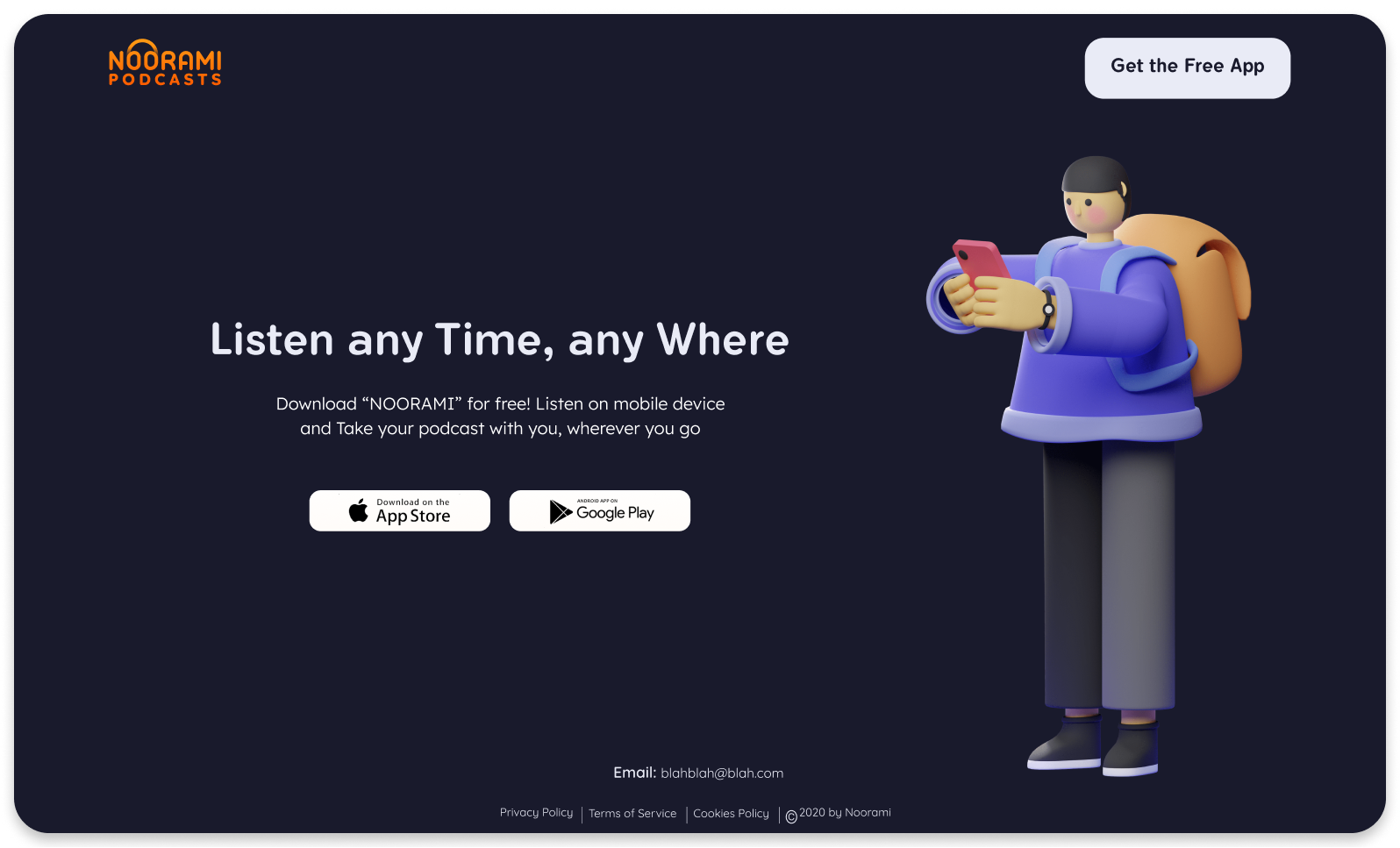
Starbucks Rewards

Redesign of Starbucks Rewards Web-page

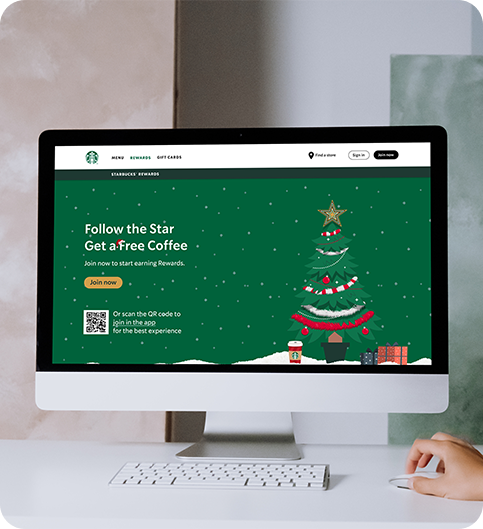
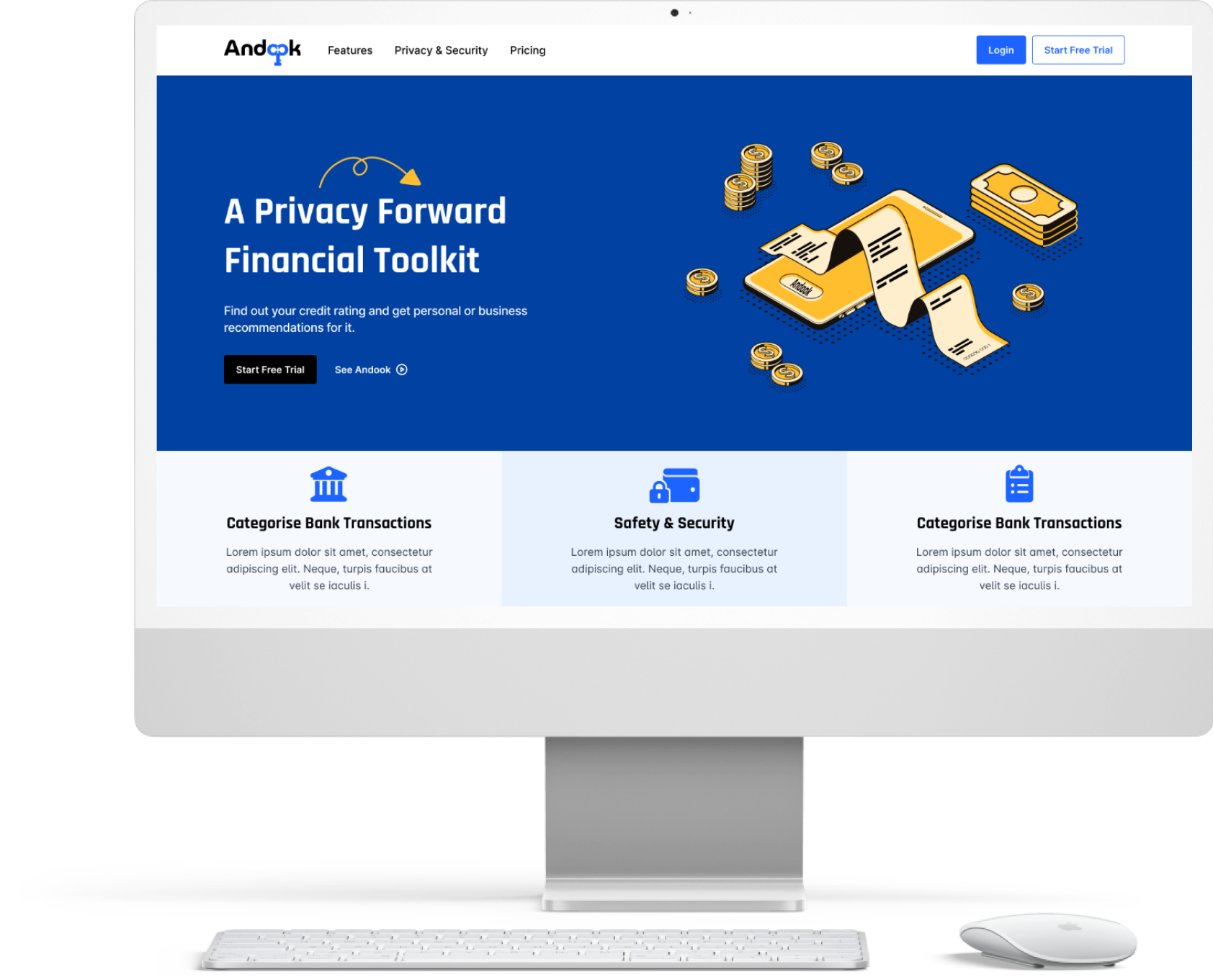
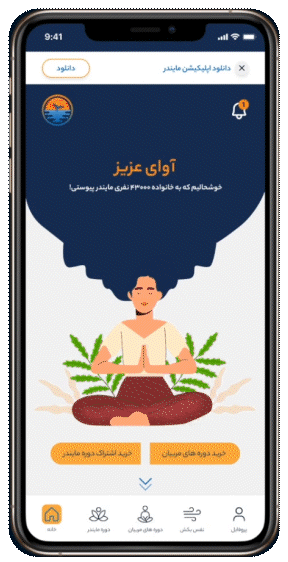
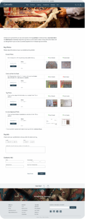
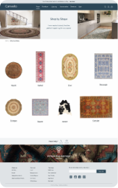
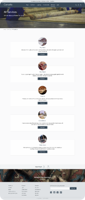
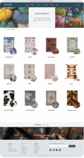
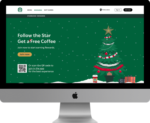
Starbucks Rewards web-page has been redesigned as a concept project that focuses on the Christmas occasion. Customers can earn and accumulate points based on purchases of products at Starbucks stores and are appreciated with free goodies, interesting tiers and engaging user experience.

Starbucks Rewards

Project Goal

The goal of this project is to improve the user interface of the Rewards web-page by making it visually interactive and attractive. This will be achieved by updating the landing page to a Christmas themed design that aligns with the holiday season, and by integrating a dynamic feature where the user can follow a moving Christmas tree star across the page. The objective is to increase user engagement, encourage the earning of Starbucks points, and meet the expectations of clients by creating a fresh, cool, and beautiful design that follows current UI trends.

work single bg work single bg

Our Process

  • Heuristic evaluation
  • Competitive analysis
  • Ideation
  •  High-fidelity concepts

We began the project by performing heuristic evaluation to understand the pain points in UI design of Starbucks Rewards’ Webpage.
At the same time, we also analyzed the main competitors to identify their strengths and weaknesses relative to our product.
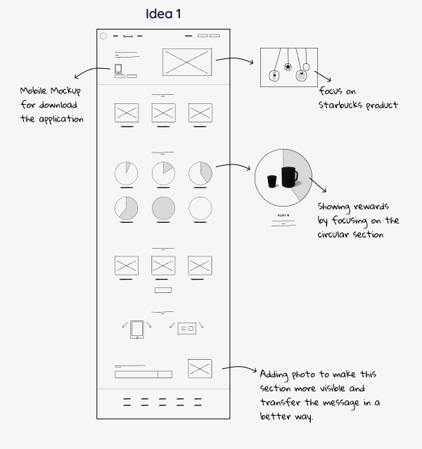
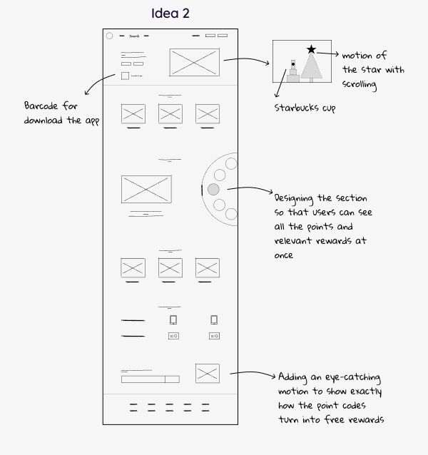
On our findings, we sketched our design ideas and after several iterations, we designed high-fidelity wireframes with the intuitive idea of the followed star as the Starbucks Rewards Program.

Sketches

Sketches
Sketches

Let's bring your product to the next level.

Get in touch with us to see how effective design can help you reach your business goals.

ETSY

Application Redesign

Etsy is a global market place for unique and creative goods. Etsy focused on handmade or vintage items and craft supplies.
This is a concept project and the mission was redesigning the Explore section of the application which has some ambiguous segments for potential users.

ETSY

Problem:

  • Absence of a search box on the explore page, hence confusion arises when users are desired to search for their intention.
  • Undistinguished “For You” and “Discover” tab bar, consequently users could not explore successfully. Overwhelming layout of the videos on the “For You” tab bar since users have to scrolling down to the page so many times.
  • Users did not grasp the concept behind of the small square on the product page.

Solution:

  • Subjoining a search bar and suggested key words, hence users can easily browse on the Explore section to find their desired products.
  • Improving the purpose of “For You” and “Discover” by take them out from two tabs into one page. Re-titling “Discover” into “Popular on Etsy” for more comprehension.
  • Erasing the small square shape and replacing it with the “View Product” hyperlink to eliminate the confusion for users.
work single bg work single bg

Our Process

  • Heuristic evaluation
  • Usability test
  • Competitive analysis
  • Wireframing
  • High-fidelity concepts

In the first step, we did some comprehensive examinations such as conducting heuristic evaluations, surveys and interviewing with potential users. After acknowledging the most common obstacles based on the examination feedback, we decided to move on to the next step which was conducting a competitive analysis. Accordingly, we apprehend all the strengths and weaknesses of Etsy’s competitors. Based on all the gathered data, we started sketching and wireframing. After multiple iterations that stemmed from examinations, we finally created high-fidelity wireframes that addressed all the user’s obstacles.

UI & Visual Design

Let's bring your product to the next level.

Get in touch with us to see how effective design can help you reach your business goals.

Andook

Privacy First, Personal Finance Tools

Andook is a privacy-centric app to help manage personal finances. In this project, we designed the Andook website as a minimum viable product (MVP) based on stakeholder requests.

Andook

Goals:

- A complete view of users’ balances and transactions across all their financial accounts in one convenient dashboard.
- Minimal and user-friendly design.
- Secure login and sign-up process.

Onboarding​:

- Onboarding is designed to help new users learn about the transaction page,
- how to manage transaction categories, filter and split their transactions.

Transaction Task

By connecting a checking or savings account, Andook can see how much is spent in different categories like groceries, electronics, or gas. users can manage categories and subcategories or split them easily.

UI & Visual Design

UI & Visual Design
UI & Visual Design
work single work single

Logo Design

Logo Design

Wireframes

Wireframes Wireframes Wireframes Wireframes Wireframes

Let's bring your product to the next level.

Get in touch with us to see how effective design can help you reach your business goals.

Minder

Meditation Application Redesign

Minder is an app that lets users meditate anywhere and anytime with its audio courses and get relief from daily stress and anxiety.

Minder

Problem:

Uncategorized and inaccessible content, which always resulted in errors, incorrect purchases, and support team intervention.
There is no user dashboard. As a result, users were reluctant to stay in the app and browse its content because they couldn't easily view or save episodes. The user interface lacked consistency and coordination, causing users to become distracted and anxious.

Solution:

Improving information architecture and redesigning the navigation menu, resulting in a success rate in the usability test was 86%.
Create a profile dashboard that matches the content of the app, including a purchase section, downloads section, settings section, and activity section.
Designing a clear visual hierarchy and an integrated user interface which facilitate access to information.

work single bg work single bg
Minder – Meditation Application

Subscription to a Plan Task

Previously, there was no clear distinction between subscription and mentoring, and finding mentors was difficult. The new design provides a variety of ways for users to access mentors and plans. By separating these features, they are more intuitive for users.

Find and Listen to an Episode Task

As part of this design, users can access mentors or plans they have subscribed to in different ways. The "View My Plans" button will appear on the homepage in the hero area once users have purchased a plan. Moreover, they can find a plan by viewing their profile, browsing their "My Plans" list, and then playing an episode. As well as viewing the last unfinished track on the home page, making it more accessible.

Minder – Meditation Application

UI & Visual Design

UI & Visual Design
UI & Visual Design
work single work single

Wireframes

Wireframes Wireframes Wireframes Wireframes Wireframes Wireframes

Let's bring your product to the next level.

Get in touch with us to see how effective design can help you reach your business goals.

Canvello

Home Decoration Marketplace Responsive Website

Canvello is a marketplace that combines Three websites based on stakeholder requests. The main focus will be on selling those three existing websites' antique rugs of specific origin, followed by home furnishings smoothly and quickly.

Canvello

Problem:

These three websites do not sell well due to their poor information architecture, lack of product descriptions, and outdated design.
Filtering on current websites is insufficient, and the users are not able to compare their chosen products.

Solution:

We aim to better understand prospective users and their needs so that we can provide: a smooth and convenient navigation, ability to filter and compare, present carpet-related services in a better way.

work single bg work single bg
Canvello – Home Decor Online Marketplace

Rooms Idea Task:

Our design will provide users with different room ideas and give them the option of selecting a room that matches their taste, seeing the price of all the items in the room at a glance and selecting the items that they like.

Compare List Task:

In order to find the most suitable antique rug for their home, it can be helpful for users to narrow down their choices and then compare them. By providing the compare list in our design, users can choose up to three items and compare their details in a frame together.

Canvello – Home Decor Online Marketplace

UI & Visual Design

UI & Visual Design
UI & Visual Design
work single work single

Wireframes

Wireframes Wireframes Wireframes Wireframes Wireframes Wireframes Wireframes Wireframes Wireframes Wireframes Wireframes Wireframes Wireframes Wireframes

Let's bring your product to the next level.

Get in touch with us to see how effective design can help you reach your business goals.

LifeCassette

Audio Based Social Network

LifeCassette is an audio-based social media application that helps you easily capture and share your moments in audio. This work is a collaboration project and took place in two phases.

LifeCassette

Problem:

The application should provide users with a smooth, satisfying experience since they haven't had a similar experience before. Having an innovative idea makes this app a new experience for users. In order to make this app successful, we must ensure a good user experience, which makes our work more challenging.

Solution:

As a result of our challenge, we conducted a lot of usability testing and iterations to make navigation and information architecture as easy for users as possible. Furthermore, we conduct extensive communication and research with users and stakeholder to determine their pain points and find a solution.

UI & Visual Design

UI & Visual Design
UI & Visual Design
work single work single

Wireframes

Wireframes Wireframes Wireframes Wireframes Wireframes Wireframes Wireframes Wireframes

Let's bring your product to the next level.

Get in touch with us to see how effective design can help you reach your business goals.

Noorami

Podcast Search and Recommendation Engine Application

Noorami is an application that uses AI to look inside the podcast audio and episodes that specifically talk about what you are interested in and extracts the specific segment of the episode most relevant to search.
In this project we collaborated with another team to design the app. In addition, we designed a website to present Noorami and its search engine to users as well as encouraging users to download the app.

Noorami

Problem:

Finding new podcasts can be difficult! And sometimes users don’t have the time to go on an exploration for new podcasts. That’s why we have worked hard to design a podcast engine that makes recommendations! Noorami is equipped with a discovery engine that looks through millions of podcasts and finds the ones that closely match users interests!

Solution:

The client requested a website that presented the Noorami applications and showed the main feature of the search engine. As this was a new technology with mostly young users, we needed a modern website as well as demonstrating the search engine and convincing users to download the app.

UI & Visual Design

UI & Visual Design
UI & Visual Design
UI & Visual Design
work single work single

Wireframes (Desktop)

Wireframes (Desktop) Wireframes (Desktop) Wireframes (Desktop)
work single work single

Wireframes (Mobile App)

Wireframes (Mobile App) Wireframes (Mobile App) Wireframes (Mobile App) Wireframes (Mobile App) Wireframes (Mobile App) Wireframes (Mobile App) Wireframes (Mobile App) Wireframes (Mobile App)

Let's bring your product to the next level.

Get in touch with us to see how effective design can help you reach your business goals.